
In the vast landscape of typography, geometric fonts have emerged as a powerful and contemporary design trend. With their clean lines, precise shapes, and modern aesthetics, geometric fonts offer a unique visual appeal. Additionally, font testing plays a crucial role in ensuring the suitability and effectiveness of fonts for various design projects. In this article, we will delve into the world of geometric fonts, examine their characteristics and applications, and explore the importance of font testing in achieving optimal typographic results.
- Understanding Geometric Fonts: Geometric fonts, as the name suggests, are typefaces that are constructed using basic geometric shapes such as circles, squares, and triangles. They embrace simplicity, minimalism, and precision in their design. Here are some key aspects of geometric fonts:
- Clean and Minimal: Geometric fonts feature simple and clean letterforms devoid of decorative elements or serifs. This minimalist approach allows them to convey a sense of modernity, efficiency, and clarity.
- Symmetry and Consistency: Geometric fonts often exhibit uniformity in stroke widths, letter proportions, and geometric construction. This consistency creates a harmonious and balanced visual rhythm throughout the typeface.
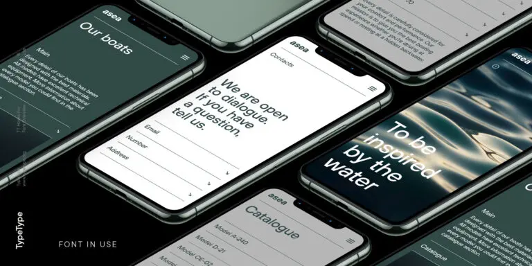
- Versatility: Due to their sleek and modern aesthetics, geometric fonts can adapt to a wide range of design applications. They are commonly used in branding, editorial design, websites, posters, and other contemporary design projects.
- The Importance of Font Testing: Font testing is an integral part of the design process, ensuring that the chosen font performs optimally in the intended context. Here’s why font test is crucial:
- Legibility and Readability: Font testing allows designers to evaluate the legibility and readability of geometric fonts in different sizes, weights, and compositions. Testing helps determine if the font remains clear and easily readable, particularly at smaller sizes or on different devices.
- Visual Compatibility: By testing geometric fonts in the actual design context, designers can assess how well the font aligns with other design elements, such as images, colors, and layout. Testing helps achieve visual harmony and coherence in the overall design composition.
- Accessibility Considerations: Font testing enables designers to ensure that geometric fonts meet accessibility guidelines, including factors like color contrast, text size, and readability for users with visual impairments. Testing helps create inclusive designs that are accessible to all users.
- Brand Consistency: Font testing is vital for maintaining brand consistency across various touchpoints. By testing geometric fonts in different applications, designers can ensure that the chosen font accurately represents the brand’s identity and values.
- Applications of Geometric Fonts: Geometric fonts find their place in a variety of design contexts, offering a contemporary and versatile aesthetic. Here are a few common applications:
- Branding and Logos: Geometric fonts are often chosen for logos and brand identities due to their clean and modern appeal. They can communicate a sense of professionalism, innovation, and efficiency.
- Editorial Design: Geometric fonts are widely used in magazine layouts, book covers, and editorial spreads. Their simplicity and legibility make them ideal for conveying information in a clear and visually engaging manner.
- Websites and Interfaces: Geometric fonts are well-suited for digital platforms, including websites, user interfaces, and mobile applications. Their clean lines and modern aesthetics enhance the user experience and create a cohesive visual identity.
- Posters and Signage: Geometric fonts excel in poster designs and signage where clarity and impact are essential. Their simplicity allows for easy readability from a distance and makes a strong visual statement.
- Font Testing Best Practices: When conducting font testing with geometric fonts, consider the following best practices:
- Test Across Devices: Ensure that the geometric font performs well on different devices, including desktops, laptops, tablets, and mobile phones. Check for legibility and consistency across various screen sizes and resolutions.
- Test with Real Content: Use actual content samples rather than lorem ipsum placeholder text during font testing. This will provide a more accurate representation of how the font behaves with real-world content.
- Test Different Weights and Sizes: Experiment with different font weights and sizes to determine the optimal combination for readability and visual appeal. Consider the hierarchy and emphasis required for different elements in the design.
- Seek Feedback: Don’t hesitate to gather feedback from colleagues, clients, or target audience members. Their insights can help identify any issues or areas for improvement in the chosen geometric font.
Conclusion:
Geometric fonts offer a contemporary and versatile typographic solution, capturing the essence of modern design with their clean lines and precision. Font testing is essential to ensure the legibility, compatibility, and effectiveness of geometric fonts in various design contexts. By understanding the characteristics and applications of geometric fonts and implementing thorough font testing practices, designers can harness the power of these fonts to create visually compelling and impactful designs.


